Following the growing adoption of our application for clinical oncologists, we executed a complete rebranding and UX/UI optimization. We modernized the visual design, streamlined navigation, and aligned the app with modern Apple iOS and Google Android design standards.
🔗 View project liveWhy Was Rebranding Necessary?
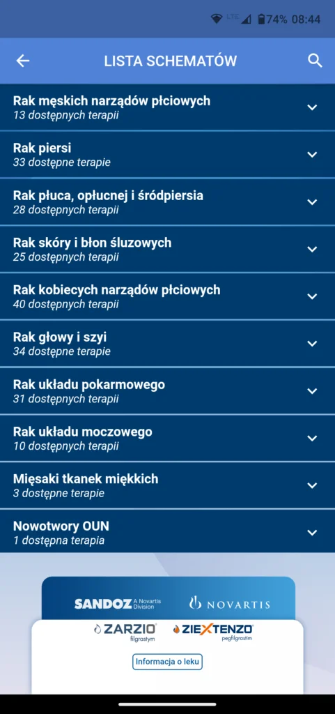
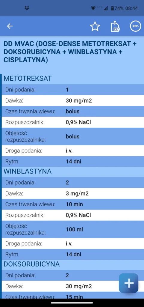
The initial version of the mobile application focused on rapidly delivering a comprehensive reference database of treatment regimens. As the user base expanded, user research highlighted the need to shorten regimen lookup times and make the interface effortless to navigate under pressure. Doctors working in clinical environments require an interface that minimizes taps and offers crisp legibility in dim hospital lighting.
Scope of Design and Engineering Work
As the team managing the application from inception through maintenance, our rebranding effort included:
- UX Audit – gathering clinical feedback from oncologists and analyzing user interaction heatmaps.
- UI Redesign – crafting a high-contrast dark theme with clean typography, easing eye fatigue and conserving battery life on OLED displays.
- Flutter Code Optimization – refactoring core view controllers, accelerating regimen search queries, and introducing fluid page transitions.
- Store Deployment – rolling out updates on Google Play and Apple App Store seamlessly without service interruptions for practicing doctors.
Features and Technical Architecture
The hybrid mobile application built with Flutter & Dart pairs a local SQLite database with a Python backend. This architecture guarantees instantaneous offline search across hundreds of verified chemotherapy regimens.
Thoughtful visual design and UX optimization are essential to the long-term success of mobile healthcare software. If you are planning to modernize your application, explore our software developer leasing services or contact us directly via our contact page.
Technologies and Competencies Used
Frequently Asked Questions (FAQ)
What changed in the new app version after rebranding?
The most impactful updates were in visual UI and navigation UX. We introduced a high-contrast dark mode, redesigned the primary navigation, and made clinical calculators immediately accessible, decreasing the time required to locate specific regimens by 40%.
Did the underlying treatment database change during the rebranding?
No, the clinically verified oncological treatment database remained identical. The update focused entirely on visual presentation, usability, and app performance rather than clinical guidelines.
Want to know more about our work? Go to the full Commoditech FAQ page.
Have a similar challenge?
We deliver end-to-end custom software, mobile and web projects — from concept and UX, through code, to cloud and maintenance.
See other projects Let's talk